 Hi and welcome to the October issue of Workshop at the Ranch. The 2004 Summer Olympic Games are still vivid in my mind. During any event there is usually time to take close notice of the graphic elements in relation to the athletes that might be pleasing to the viewer. The incorporation of graphic design into your photography will be well worth your efforts. Editors always take notice of these kinds of images in your portfolio and many publications use them as double page spreads and openers for the feature article. With a mind set on graphics and design let’s take a look at some Olympic images with an artistic approach…
Hi and welcome to the October issue of Workshop at the Ranch. The 2004 Summer Olympic Games are still vivid in my mind. During any event there is usually time to take close notice of the graphic elements in relation to the athletes that might be pleasing to the viewer. The incorporation of graphic design into your photography will be well worth your efforts. Editors always take notice of these kinds of images in your portfolio and many publications use them as double page spreads and openers for the feature article. With a mind set on graphics and design let’s take a look at some Olympic images with an artistic approach…
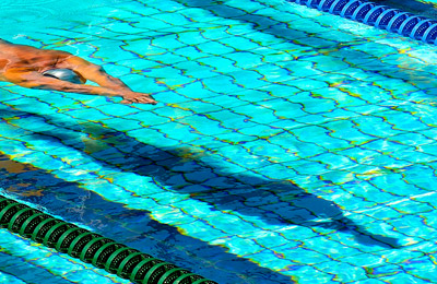
 Image #1 There are some very interesting things going on in this image of a swimmer gliding underwater after his racing start. To begin with, the photographer must study the scene and look beyond the typical sports image. Take time during the qualifying rounds and qualifying heats of competitions to walk around the venue and study LIGHT, SHADOW, COLOR, SHAPE and DESIGN that surrounds the athlete. In this case, the pool floor is tile and an Olympic pool is quite shallow. At 10:00am the sun LIGHT strikes the swimmer and casts a SHADOW on the pool floor. The water refracts the LIGHT and causes interesting SHAPES of the tiles. The aqua COLOR and contrast between the swimmer’s body, the SHADOW and the refracted tiles, along with the positioning of the athlete in the upper 1/3 of the frame is…….interesting, different from the norm and, well……GRAPHIC. Nikon D2H, ISO200, 1/1000th sec f9, NEW Nikon 200mm G VR f2 lens, WB Cloudy, Lexar 1G Flash Card. Image #1 There are some very interesting things going on in this image of a swimmer gliding underwater after his racing start. To begin with, the photographer must study the scene and look beyond the typical sports image. Take time during the qualifying rounds and qualifying heats of competitions to walk around the venue and study LIGHT, SHADOW, COLOR, SHAPE and DESIGN that surrounds the athlete. In this case, the pool floor is tile and an Olympic pool is quite shallow. At 10:00am the sun LIGHT strikes the swimmer and casts a SHADOW on the pool floor. The water refracts the LIGHT and causes interesting SHAPES of the tiles. The aqua COLOR and contrast between the swimmer’s body, the SHADOW and the refracted tiles, along with the positioning of the athlete in the upper 1/3 of the frame is…….interesting, different from the norm and, well……GRAPHIC. Nikon D2H, ISO200, 1/1000th sec f9, NEW Nikon 200mm G VR f2 lens, WB Cloudy, Lexar 1G Flash Card.
|
|
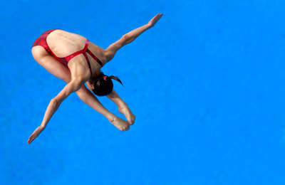
 Image #2 An athlete against a background of solid color is always a nice change of pace for the photographer, the editor, and the viewer. If I had positioned myself directly overhead I would have seen the spray of water that breaks the water surface for the diver in my frame. Positioning myself off to the side cleaned the background completely. Perfect form and a red suit helped complete this image of Wu Minnxie of China during the 3m Women’s Diving Finals. By placing her in the corner of the frame I have not only made the design more interesting but left room for copy as well. Nikon D2H, ISO500, 1/1250th sec, NEW Nikon 200mm G VR f2 lens, WB 5800K, Lexar 1G Flash Card. Image #2 An athlete against a background of solid color is always a nice change of pace for the photographer, the editor, and the viewer. If I had positioned myself directly overhead I would have seen the spray of water that breaks the water surface for the diver in my frame. Positioning myself off to the side cleaned the background completely. Perfect form and a red suit helped complete this image of Wu Minnxie of China during the 3m Women’s Diving Finals. By placing her in the corner of the frame I have not only made the design more interesting but left room for copy as well. Nikon D2H, ISO500, 1/1250th sec, NEW Nikon 200mm G VR f2 lens, WB 5800K, Lexar 1G Flash Card.
|
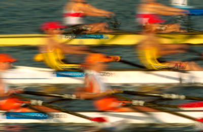
 Image #3 This time I have slowed down the shutter speed to allow the action of the rowers to dominate the viewers imagination. Image #3 This time I have slowed down the shutter speed to allow the action of the rowers to dominate the viewers imagination. Design is sometimes the use of elements in a picture to stimulate the viewers imagination. I was positioned in a truck that drove parallel to the rowers as the raced down the course. The truck kept pace with the rowers thus allowing me to pan at a slower shutter speed for multiple frames. COLOR, SHAPES and LIGHT along with the DESIGN created by the motion of the athletes result in a picture that captures the feel of Olympic rowing almost as if I were in the race. The road was less than smooth but the VR feature of the Nikon 200mm – 400mm G VR lens smoothed the horizontal lines thus holding the image together for the viewer. Nikon D2H, ISO200, 1/25th sec at f45, Nikon 200mm – 400mm G VR lens (VR Active mode), Nikon TC14E 1.4X Teleconverter, WB Coudy, Lexar 1G Flash Card. |
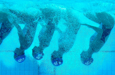
 Image #4 This image of Synchronized Swimmers from Russia was captured during training through an underwater window. The silhouette effect caused by the sunLIGHT on the bubbles and the athletes in SHADOW floating in an almost monochromatic setting is already GRAPHICALLY unique, but the inverted position of the group really draws me into the picture. This sport is choreographed to music and athletes will repeat a sequence of their routine several times until perfect. Take advantage of training sessions with these kinds of sports. If the athletes are willing to repeat skills 20 times, the photographer should watch, learn and THEN capture an image. Nikon D2H, ISO400, 1/400th sec at f6.3, Nikon 35mm – 70mm lens, Lexar 1G Flash Card. Image #4 This image of Synchronized Swimmers from Russia was captured during training through an underwater window. The silhouette effect caused by the sunLIGHT on the bubbles and the athletes in SHADOW floating in an almost monochromatic setting is already GRAPHICALLY unique, but the inverted position of the group really draws me into the picture. This sport is choreographed to music and athletes will repeat a sequence of their routine several times until perfect. Take advantage of training sessions with these kinds of sports. If the athletes are willing to repeat skills 20 times, the photographer should watch, learn and THEN capture an image. Nikon D2H, ISO400, 1/400th sec at f6.3, Nikon 35mm – 70mm lens, Lexar 1G Flash Card. |
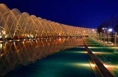
 Image #5 Architecture has always interested me and the Olympics usually bring out the most unique designs of the time. Image #5 Architecture has always interested me and the Olympics usually bring out the most unique designs of the time. This is the Olympic Archway in the OAKA Olympic park area. Spectators can walk from the Velodrome to the Tennis Stadium and Olympic Stadium for Athletics during the heat of the day for 250 yards or more and be shaded by the arches at mid day. At night the Olympic Arches LIGHT up. More often than not the photographer is so busy downloading and sending images that they seldom take the time to look around after the event is over. I knew when the sun would set and when evening COLOR would be in the sky. The SHAPE of the arches and their COLOR and placement in the frame along with the reflection and LIGHTS in the water all add up to GRAPHICS and DESIGN. Simple, yet, pleasing to look at. Nikon D2H, ISO320, 1/40th sec at f5.6, Nikon 12mm – 24mm G lens, WB7000K, Lexar 1G Flash Card. |
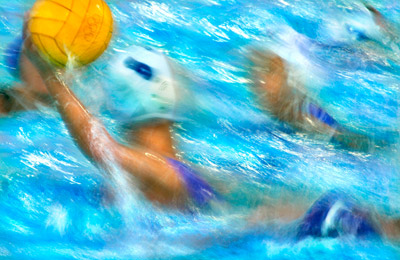
 Image #6 Slow shutter action again. In this image I have allowed the LIGHT reflecting on the water, the COLOR of the water and waterpolo ball, the HIGHLIGHTS and SHADOWS to work in harmony with the action and placement of the athletes. A GRAPHIC DESIGN that say’s “waterpolo”. The ladies GOLD medal match between Greece and Italy was played under the lights so I used the elements at hand to capture something both ARTISTIC and GRAPHIC. This scene did not happen in the first few frames. It took some patience and study to see were the LIGHT best reflected off the water, were the players would position themselves, and choosing the correct shutter speed from past experience with this sport to capture a pleasing image. I get my best results when I work the scene rather than a “shotgun” effect and hope for the best. Nikon D2H, ISO320, 1/13th sec f5, Nikon 400mm f2.8 lens, WB6300K, Bogen Carbon Fiber Monopod, Lexar 1G Flash Card. Image #6 Slow shutter action again. In this image I have allowed the LIGHT reflecting on the water, the COLOR of the water and waterpolo ball, the HIGHLIGHTS and SHADOWS to work in harmony with the action and placement of the athletes. A GRAPHIC DESIGN that say’s “waterpolo”. The ladies GOLD medal match between Greece and Italy was played under the lights so I used the elements at hand to capture something both ARTISTIC and GRAPHIC. This scene did not happen in the first few frames. It took some patience and study to see were the LIGHT best reflected off the water, were the players would position themselves, and choosing the correct shutter speed from past experience with this sport to capture a pleasing image. I get my best results when I work the scene rather than a “shotgun” effect and hope for the best. Nikon D2H, ISO320, 1/13th sec f5, Nikon 400mm f2.8 lens, WB6300K, Bogen Carbon Fiber Monopod, Lexar 1G Flash Card.
|
Shooting artistic/graphic images is perhaps new to many of you. It may not come easy at first but with a strong effort to look for LIGHT, SHADOW, COLOR, SHAPE and DESIGN surrounding the athletes it won’t take you long to see results. If the photographer would divorce themselves from the standard image for a few minutes of each game or event and concentrate on these elements, then they will begin to see the graphic and artistic dimension of sport. I believe your editors will thank you, but most of all you will find your images being used larger and with more prominence. Until next time at Workshop at the Ranch…………………..Adios, Dave
![]() Hi and welcome to the October issue of Workshop at the Ranch. The 2004 Summer Olympic Games are still vivid in my mind. During any event there is usually time to take close notice of the graphic elements in relation to the athletes that might be pleasing to the viewer. The incorporation of graphic design into your photography will be well worth your efforts. Editors always take notice of these kinds of images in your portfolio and many publications use them as double page spreads and openers for the feature article. With a mind set on graphics and design let’s take a look at some Olympic images with an artistic approach…
Hi and welcome to the October issue of Workshop at the Ranch. The 2004 Summer Olympic Games are still vivid in my mind. During any event there is usually time to take close notice of the graphic elements in relation to the athletes that might be pleasing to the viewer. The incorporation of graphic design into your photography will be well worth your efforts. Editors always take notice of these kinds of images in your portfolio and many publications use them as double page spreads and openers for the feature article. With a mind set on graphics and design let’s take a look at some Olympic images with an artistic approach… 

