 Hi and welcome to this edition of Workshop at the Ranch. Composition and design are often times an after thought for the sports photographer. Maybe I’m old fashion but I still believe, as do many of the editors and art directors I have had the pleasure to work with, that a well composed image containing design and elegance still satisfies the viewers eye. When I’m not out photographing or teaching photography I am usually selling images from my picture archives. And while many of the pictures that are published involve key moments in sports history a near equal number of images that sell illustrate a larger idea, a sense of place and have an artistic composition and design. These pictures have been successful in the marketplace because of good composition, dynamic light, color and a moment of anticipation.
Hi and welcome to this edition of Workshop at the Ranch. Composition and design are often times an after thought for the sports photographer. Maybe I’m old fashion but I still believe, as do many of the editors and art directors I have had the pleasure to work with, that a well composed image containing design and elegance still satisfies the viewers eye. When I’m not out photographing or teaching photography I am usually selling images from my picture archives. And while many of the pictures that are published involve key moments in sports history a near equal number of images that sell illustrate a larger idea, a sense of place and have an artistic composition and design. These pictures have been successful in the marketplace because of good composition, dynamic light, color and a moment of anticipation.
Pictures that contain all the necessary elements require some thought beyond the isolated athlete or key moment of the game but I encourage photographers to always be looking for the Rule of Thirds composition that I prefer to call the “Triple Play” or the “Hat Trick” or I even call it the “Trifecta” of Design. Call it whatever you like but when the Rule of Thirds is used three ways: 1. horizontally across the frame, 2. vertically through the height of the frame, and 3. and in the depth of the frame with a foreground, middle ground and background, then you will have the start of something wonderful …………..
|
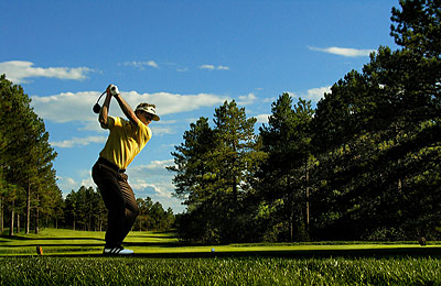
 Image #1 Evening Drive … This image of Germany’s golf master Bernhard Langer is a good example of the rule of thirds. Instead of shooting tight on my subject I chose to shoot a broader view. This allows me to get creative with what I like to call the “Triple Play” … the “Hat Trick” … or even the “Trifecta” of Design … Yes, you guessed it, … the Rule of Thirds, but more thirds than you might think …. 1. thirds across (horizontally across the frame), 2. thirds high (vertically from the bottom of the frame to the top of the frame) and 3. thirds deep (foreground, middle ground and background.) Bernhard is placed in the far left third moving across the frame. The frame is also compositionally divided into thirds high with him placed in the middle third moving from bottom to top. The thirds deep is accomplished compositionally by Bernhard being placed up close in the foreground, the pine trees surrounding him are the middle ground, while the back ground is achieved compositionally by the trees themselves leading the viewers eye far down the vanishing fairway to some small pines on the horizon of blue sky and clouds. There is late day dramatic light streaking through the pines, his yellow shirt offers an accent of color that catches the viewer’s eye and good timing on the shutter release button stopped the action at the top of his back-swing completes the picture with a moment of anticipation. This action happens hundreds of times each tournament. The goal is to find the course location that offers as many of these elements as possible and then be there to capture the image. Nikon Coolpix 8800, ISO100, Aperture Priority with EV-1.7, WB Cloudy, Lexar 4G Flash Card. It is all these design elements along with a moment of anticipation, the top of the back-swing that makes this picture work. (NOTE: the Nikon Coolpix 8800 is a silent shutter and does not disturb the golfer in the midst of his back-swing Check out previous articles of Workshop at the Ranch and On The Road for more examples of the Nikon Coolpix 8800.) Image #1 Evening Drive … This image of Germany’s golf master Bernhard Langer is a good example of the rule of thirds. Instead of shooting tight on my subject I chose to shoot a broader view. This allows me to get creative with what I like to call the “Triple Play” … the “Hat Trick” … or even the “Trifecta” of Design … Yes, you guessed it, … the Rule of Thirds, but more thirds than you might think …. 1. thirds across (horizontally across the frame), 2. thirds high (vertically from the bottom of the frame to the top of the frame) and 3. thirds deep (foreground, middle ground and background.) Bernhard is placed in the far left third moving across the frame. The frame is also compositionally divided into thirds high with him placed in the middle third moving from bottom to top. The thirds deep is accomplished compositionally by Bernhard being placed up close in the foreground, the pine trees surrounding him are the middle ground, while the back ground is achieved compositionally by the trees themselves leading the viewers eye far down the vanishing fairway to some small pines on the horizon of blue sky and clouds. There is late day dramatic light streaking through the pines, his yellow shirt offers an accent of color that catches the viewer’s eye and good timing on the shutter release button stopped the action at the top of his back-swing completes the picture with a moment of anticipation. This action happens hundreds of times each tournament. The goal is to find the course location that offers as many of these elements as possible and then be there to capture the image. Nikon Coolpix 8800, ISO100, Aperture Priority with EV-1.7, WB Cloudy, Lexar 4G Flash Card. It is all these design elements along with a moment of anticipation, the top of the back-swing that makes this picture work. (NOTE: the Nikon Coolpix 8800 is a silent shutter and does not disturb the golfer in the midst of his back-swing Check out previous articles of Workshop at the Ranch and On The Road for more examples of the Nikon Coolpix 8800.)
|
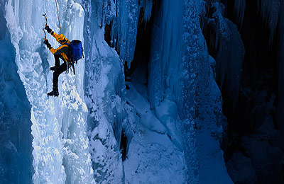
 Image #2 Ice Ascent … This image of Ice Climber Chris Alstrin again illustrates the use of the “Triple Play” … the “Hat Trick” … the “Trifecta” of Design along with dynamic Light, an accent of color and a moment of anticipation. There are thirds across: the subject in the left third of the frame, thirds high: his colorful jacket and helmet are in the upper third of the frame, and thirds deep: there is a shadowed section of the ice gorge in the foreground, the subject is in the lit middle ground and more deep shadowed ice gorge is the background. As I explained in last months On The Road article featuring Ice Climbing in Ouray, there is no sunlight in the ice gorge. Two Elinchrom Ranger RX Speed AS packs and strobe heads with sport reflectors were used to illuminate a third of the scene that included our subject. The Rule of Thirds combined with dynamic light, an ascent of color and a moment of anticipation works again. Nikon D2Xs, 1/250 at f7.1, Nikon 200-400 G VR Zoom Lens, WB 4500K, Two Elinchrom Ranger RX Speed AS packs and Strobe Heads with Sport Reflectors, Two Bogen Lightstands, Pocket Wizard Multi Max Transceivers, Lexar 4G Flash Card, 2 inch spiked cramp-ons. (NOTE: the vertical image of Chris that ran in last month’s On The Road was captured with a second camera, a Nikon D200 and Nikon 70-200 Zoom Lens and also made use of the Triple Play … the Hat Trick … the Trifecta of Design (call it what you will) … the Rule of Thirds across, high, and deep combined with dynamic light, an accent of color and a moment of anticipation all of which made for a successful image.) Image #2 Ice Ascent … This image of Ice Climber Chris Alstrin again illustrates the use of the “Triple Play” … the “Hat Trick” … the “Trifecta” of Design along with dynamic Light, an accent of color and a moment of anticipation. There are thirds across: the subject in the left third of the frame, thirds high: his colorful jacket and helmet are in the upper third of the frame, and thirds deep: there is a shadowed section of the ice gorge in the foreground, the subject is in the lit middle ground and more deep shadowed ice gorge is the background. As I explained in last months On The Road article featuring Ice Climbing in Ouray, there is no sunlight in the ice gorge. Two Elinchrom Ranger RX Speed AS packs and strobe heads with sport reflectors were used to illuminate a third of the scene that included our subject. The Rule of Thirds combined with dynamic light, an ascent of color and a moment of anticipation works again. Nikon D2Xs, 1/250 at f7.1, Nikon 200-400 G VR Zoom Lens, WB 4500K, Two Elinchrom Ranger RX Speed AS packs and Strobe Heads with Sport Reflectors, Two Bogen Lightstands, Pocket Wizard Multi Max Transceivers, Lexar 4G Flash Card, 2 inch spiked cramp-ons. (NOTE: the vertical image of Chris that ran in last month’s On The Road was captured with a second camera, a Nikon D200 and Nikon 70-200 Zoom Lens and also made use of the Triple Play … the Hat Trick … the Trifecta of Design (call it what you will) … the Rule of Thirds across, high, and deep combined with dynamic light, an accent of color and a moment of anticipation all of which made for a successful image.)
|
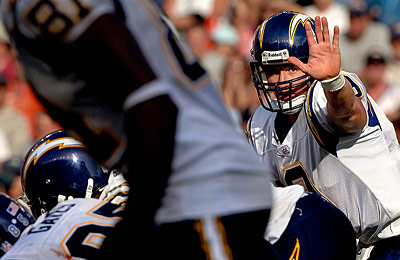
 Image #3 Stop Action … This is not the typical image of a quarterback … which is why I probably like it. It would be more common to shoot a vertical frame and try to isolate the quarterback but I chose to compose the image with … you guessed it the “Triple Play/Hat Trick/Trifecta” of Design … thirds across, thirds high and thirds deep … (Rule of Thirds composition) along with dynamic light, an accent of color and a moment of anticipation. The subject: the quarterback and especially his eye and hand are in the right third moving across the frame and also in the upper third of the frame moving from bottom to top. The wide out in shadow works well in the foreground (note: if the wide out was sunlit it would be too distracting and greatly reduce the success of the image.) The subject (the quarterback) is the middle ground and the crowd is the background. The sun is low enough in the sky that his left eye is lit and looking directly at me. His hand gesture gives the viewer a moment of anticipation …….. the accent of color ?… well, the yellow lightning bolts on the San Diego Charger’s helmet will have to do. Certainly a more colorful helmet would be nice … or blood, … yes, red blood on the bridge of the quarterback’s nose would really help. Unfortunately the photographer covering an event must work with what they are given. No worries, I still try to incorporate as many of the elements that help make a picture successful as I can … thirds across, thirds high, thirds deep, light, color, moment, … I’m always looking. Nikon D2X, ISO200, 1/1250 at f5.6, Nikon 200-400mm G VR Zoom Lens, WB 5600K, Lexar 4G Flash Card. Image #3 Stop Action … This is not the typical image of a quarterback … which is why I probably like it. It would be more common to shoot a vertical frame and try to isolate the quarterback but I chose to compose the image with … you guessed it the “Triple Play/Hat Trick/Trifecta” of Design … thirds across, thirds high and thirds deep … (Rule of Thirds composition) along with dynamic light, an accent of color and a moment of anticipation. The subject: the quarterback and especially his eye and hand are in the right third moving across the frame and also in the upper third of the frame moving from bottom to top. The wide out in shadow works well in the foreground (note: if the wide out was sunlit it would be too distracting and greatly reduce the success of the image.) The subject (the quarterback) is the middle ground and the crowd is the background. The sun is low enough in the sky that his left eye is lit and looking directly at me. His hand gesture gives the viewer a moment of anticipation …….. the accent of color ?… well, the yellow lightning bolts on the San Diego Charger’s helmet will have to do. Certainly a more colorful helmet would be nice … or blood, … yes, red blood on the bridge of the quarterback’s nose would really help. Unfortunately the photographer covering an event must work with what they are given. No worries, I still try to incorporate as many of the elements that help make a picture successful as I can … thirds across, thirds high, thirds deep, light, color, moment, … I’m always looking. Nikon D2X, ISO200, 1/1250 at f5.6, Nikon 200-400mm G VR Zoom Lens, WB 5600K, Lexar 4G Flash Card.
|
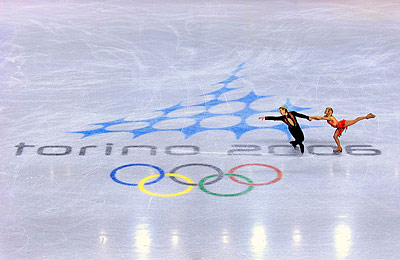
 Image #4 Ice Dancers … This picture makes use of the graphics on the ice to help accomplish thirds across, thirds high and thirds deep, color and moment. The athletes are placed in the far right third (thirds across) and middle third of (thirds high) composition. The Olympic Rings (foreground) that begin to lead the viewers eye up to the Torino 2006 and subjects are the middle ground and lead to the sweeping graphic blue diamonds logo (back ground) creating depth (thirds deep) to this otherwise flatly lit image. The Olympic Rings and young lady’s red costume add the accent of color to a predominantly icy bluish gray scene. The skater’s body language and the long horizontal scrape mark made by the skater’s blade scraping across the words Torino 2006 suggest an athletic dynamic that gives the image not so much of a moment but some additional energy that works well. Although this image lacks dramatic light remember that when covering an event strobe lighting is not always allowed and the photographer must work with the available light, but we should look for as many of the elements that help make an image successful even if the light is flat as was the case at the Winter Olympic Ice Hall in Torino. Nikon D2X, ISO800, 1/500 at f4, Nikon 70-200 VR Zoom Lens as a remote, WB Fluorescent-2 with Hue Adjustment-3, Bogen Super Clamp and Bogen Magic Arm with safety strap, Pocket Wizard Multi Max Transceivers and N90 M3 Pre Trigger Release to trigger the camera, Lexar 4G Flash Card. Image #4 Ice Dancers … This picture makes use of the graphics on the ice to help accomplish thirds across, thirds high and thirds deep, color and moment. The athletes are placed in the far right third (thirds across) and middle third of (thirds high) composition. The Olympic Rings (foreground) that begin to lead the viewers eye up to the Torino 2006 and subjects are the middle ground and lead to the sweeping graphic blue diamonds logo (back ground) creating depth (thirds deep) to this otherwise flatly lit image. The Olympic Rings and young lady’s red costume add the accent of color to a predominantly icy bluish gray scene. The skater’s body language and the long horizontal scrape mark made by the skater’s blade scraping across the words Torino 2006 suggest an athletic dynamic that gives the image not so much of a moment but some additional energy that works well. Although this image lacks dramatic light remember that when covering an event strobe lighting is not always allowed and the photographer must work with the available light, but we should look for as many of the elements that help make an image successful even if the light is flat as was the case at the Winter Olympic Ice Hall in Torino. Nikon D2X, ISO800, 1/500 at f4, Nikon 70-200 VR Zoom Lens as a remote, WB Fluorescent-2 with Hue Adjustment-3, Bogen Super Clamp and Bogen Magic Arm with safety strap, Pocket Wizard Multi Max Transceivers and N90 M3 Pre Trigger Release to trigger the camera, Lexar 4G Flash Card. |

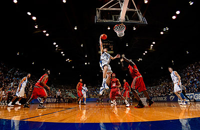
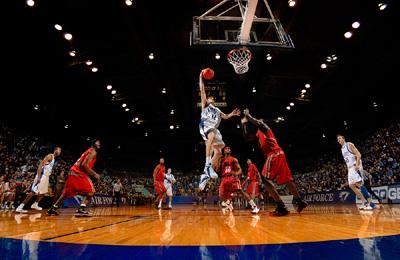
Image #5 Airborne Jam … The United States Air Force Academy has steadily risen in the NCAA Basketball ranks over the years to where they are now emerging as a top 20 team. This Workshop at the Ranch topic has been the Rule of Thirds but more specifically thirds across, thirds high and especially thirds deep. I have emphasized this thirds, thirds, thirds by calling it the “Triple Play”, or the “Hat Trick”, or even the “Trifecta” of Design in an effort to better plant this compositional structure in your mind. Here again I have chosen not to isolate my athlete by shooting a tight vertical but chose to use a wider lens and show the viewer the entire scene. The player about to make the jam is in the middle third of the frame horizontally (thirds across). He is also in the middle third of the frame vertically (thirds high). And he is in the foreground third while the other players are in the middle ground third and the fans are in the background third (thirds deep). Thirds across, thirds high and thirds deep. The lighting is made dramatic as our players are perfectly lit with Elinchrom sport strobe lighting and are separated from the dark background of the arena. There is some nice color in the UNLV uniforms and the court, but it is the orange basketball against the black background that commands the attention of the viewers eye and fulfills the accent of color needed. The moment of anticipation is obvious as our central figure is about to score in a stylish and definitive way. The “Triple Play”, the “Hat Trick”, the “Trifecta” of Design ………. thirds across, thirds high and thirds deep combined with dramatic light, an accent of color and a moment of anticipation. This is always a winning formula. Nikon D2X, ISO200, 1/250 at f5.6, Nikon 10.5mm Fisheye Lens with Fisheye Correction in Nikon Capture NX, WB 6300K, 5 Elinchrom 600RX Sport Strobes (2 strobes aimed at the players and 3 strobes aimed at the audience,) Bogen Super Clamps to mount the Elinchrom 600RX Sport Strobes to the arena catwalks, Elinchrom Sport Reflectors, Safety Straps, Pocket Wizard Multi Max Transceivers to trigger the strobes, Lexar 4G Flash Card.
|
The rule of thirds is often only thought of as being a two dimensional design element, horizontal (across) and vertical (high), but my hope is that this Workshop at the Ranch illustrates that by composing some of your images with the “Triple Play”, the “Hat Trick”, the “Trifecta” of Design … (thirds across, thirds high and especially thirds deep) combined with dynamic light, an accent of color and a moment of anticipation then you will have far more successful pictures and sales. It is safe to say all these elements do not happen with every picture. Photographing sports action is already a challenging task and the isolated subject can be just what your editor demands, but I encourage all of you to start looking for the “Triple Play”, … OK, the “Hat Trick”, … Yes, I even call it the “Trifecta” of Design each time you go out to shoot. Then add the elements of dynamic light, an accent of color and a moment of anticipation and your pictures will be come alive and graphically more successful.
See you next time at Workshop at the Ranch …………………… Adios. Dave
![]() Hi and welcome to this edition of Workshop at the Ranch. Composition and design are often times an after thought for the sports photographer. Maybe I’m old fashion but I still believe, as do many of the editors and art directors I have had the pleasure to work with, that a well composed image containing design and elegance still satisfies the viewers eye. When I’m not out photographing or teaching photography I am usually selling images from my picture archives. And while many of the pictures that are published involve key moments in sports history a near equal number of images that sell illustrate a larger idea, a sense of place and have an artistic composition and design. These pictures have been successful in the marketplace because of good composition, dynamic light, color and a moment of anticipation.
Hi and welcome to this edition of Workshop at the Ranch. Composition and design are often times an after thought for the sports photographer. Maybe I’m old fashion but I still believe, as do many of the editors and art directors I have had the pleasure to work with, that a well composed image containing design and elegance still satisfies the viewers eye. When I’m not out photographing or teaching photography I am usually selling images from my picture archives. And while many of the pictures that are published involve key moments in sports history a near equal number of images that sell illustrate a larger idea, a sense of place and have an artistic composition and design. These pictures have been successful in the marketplace because of good composition, dynamic light, color and a moment of anticipation. 

